PROPOSAL
Music marketing has evolved beyond traditional print promotion into a multi-platform experience that blends physical products, digital media, and brand storytelling. In today’s landscape, bands are expected to maintain strong visual identities across social media in addition to their merchandise and live events in order to build loyal fan communities. This project explores how marketing-driven design can be used to create a cohesive, yet immersive brand presence for a fictional alternative Y2K band, PinkRot.
Pinkrot is an alternative band (brand) rooted in early-2000s nostalgia and youthful defiance. The brand speaks to a generation that finds comfort in imperfection, blending soft elements with abrasive textures and distorted typography. Pinkrot’s visual identity embraces contrast, such as cute versus unnerving, to reflect the tension between vulnerability and rebellion. The brand exists as both a musical identity and a cultural statement.
The primary target audience consists of alternative music fans and young adults ages 18–45 who actively engage with music culture through social media, live events, and merchandise. This project aims to showcase advanced skills in branding, marketing design, and campaign development while reflecting real-world industry practices.
OBJECTIVES
To independently research, design, and produce a cohesive visual identity and marketing system for the fictional alternative band Pinkrot, including branding, promotional materials, and merchandise.
To research early-2000s alternative, pop-punk, and Y2K visual culture in order to inform the aesthetic direction of the project.
To explore branding as a narrative and marketing tool by developing a distinct personality, tone, and visual language for Pinkrot.
To apply principles of typography, color, layout, hierarchy, and visual storytelling consistently across all deliverables.
To actively self-critique and refine designs throughout the creative process while incorporating feedback from peers and instructors.
To produce a cohesive, polished body of work that demonstrates strong conceptual thinking, technical skill, and professional presentation.
BAND ORIGIN
Pinkrot formed in Pittsburgh as a response to creative burnout and emotional stagnation. Emerging from a city known for its gritty industrial history and tight-knit creative communities, the band’s identity reflects contrast — soft emotions layered over harsh textures, decay paired with color.
The project began as a solo-driven vision, with Pinkrot initially developing through at-home recordings, self-directed branding, and visual experimentation. The band’s aesthetic and tone were shaped by late-night creative sessions, underground show culture, and the emotional honesty that often comes from smaller, overlooked scenes rather than mainstream music hubs.
RESEARCH SYNOPSIS
My research for this project included many different components. First, I explored successful alternative rock band logos and symbols, while also studying the type of aesthetic that would best fit a woman-led alternative rock band. I listened to and researched a variety of bands, including Pierce the Veil, Slipknot, Pussy Riot, Twenty One Pilots, and others, to better understand visual identity, tone, and audience appeal.
I also researched what components an alternative rock band would need to become established from a marketing perspective. This included studying merchandise, websites, social media content, posters, and other promotional materials to gain insight into what is currently popular within the alternative rock scene. Additionally, I looked into the symbolism behind different objects that could be incorporated into Pinkrot’s branding and album designs.
To begin my design process, I researched color palettes with meanings that could feel somewhat contradictory, as contrast and duality are central themes behind Pinkrot’s identity.
DELIVERABLES
Brand & Identity
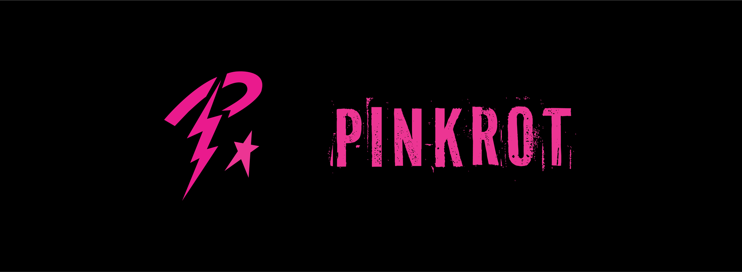
Primary band logo
Band symbol & icon
Brand Guidelines
Typography system (display + functional)
Color palette & usage rules
Texture & image treatment system
Logo usage & clear space
Color specifications
Typography hierarchy
Photography & visual tone
Social media application rules
Marketing & Promotion
Electronic Press Kit (EPK)
Band bio
Band imagery layouts
Album overview
Tour highlights
Contact & links
Social Media Campaign (15 posts total)
5 album drop countdown posts
1 merch drop post
1 fan-exclusive merch drop post
2 ticket countdown posts
1 tickets-live announcement
1 tour dates/info post
4 band photoshoot posts
Website Homepage (Merch / Drop Focused)
Hero drop section
Featured merch modules
Tour callout
Email sign-up
Visual continuity with social + packaging
Physical Designs
Vinyl album packaging (sleeve + label)
T-shirt designs (3 total)
1 tour shirt
2 general band shirts
Poster designs (2 total)
1 tour poster
1 general promotional poster
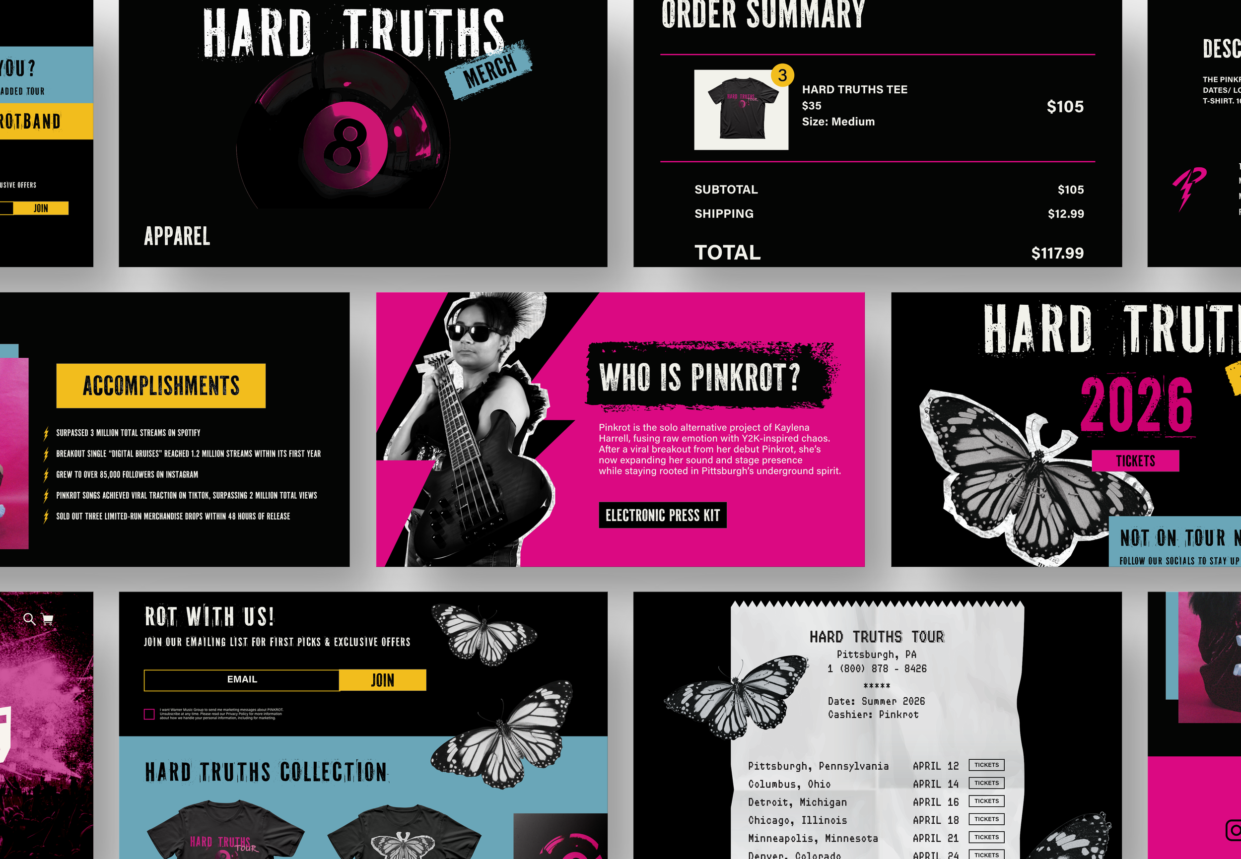
BRAND GUIDELINES
As a part of my project, I developed a comprehensive set of brand guidelines for Pinkrot to ensure a cohesive and recognizable identity across all platforms. The guide includes logo usage and clear space rules, typography systems and hierarchy, color palettes and specifications, texture and image treatments, photography direction, visual tone, and social media application standards. Click here to explore the full Pinkrot Brand Guidelines.
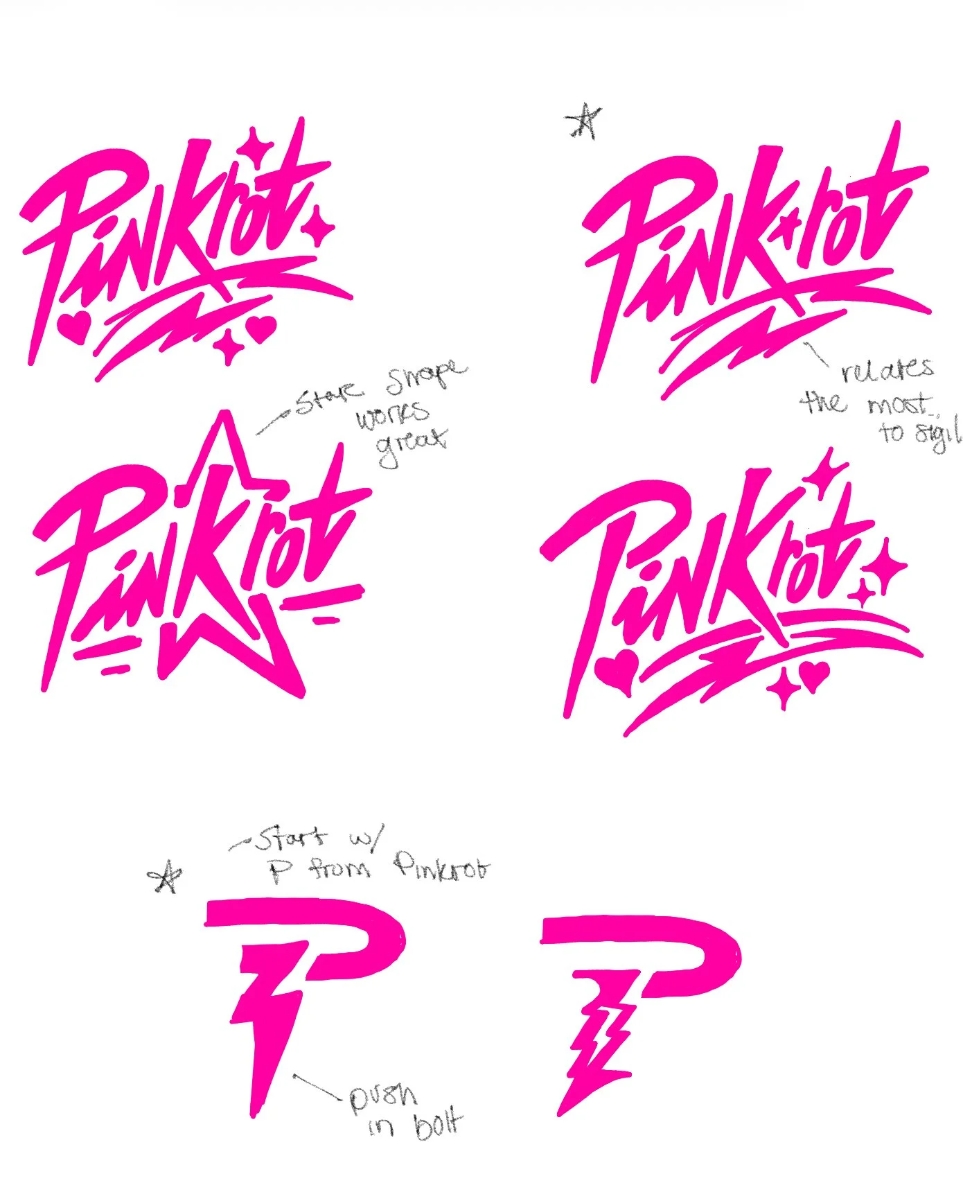
LOGO PROCESS
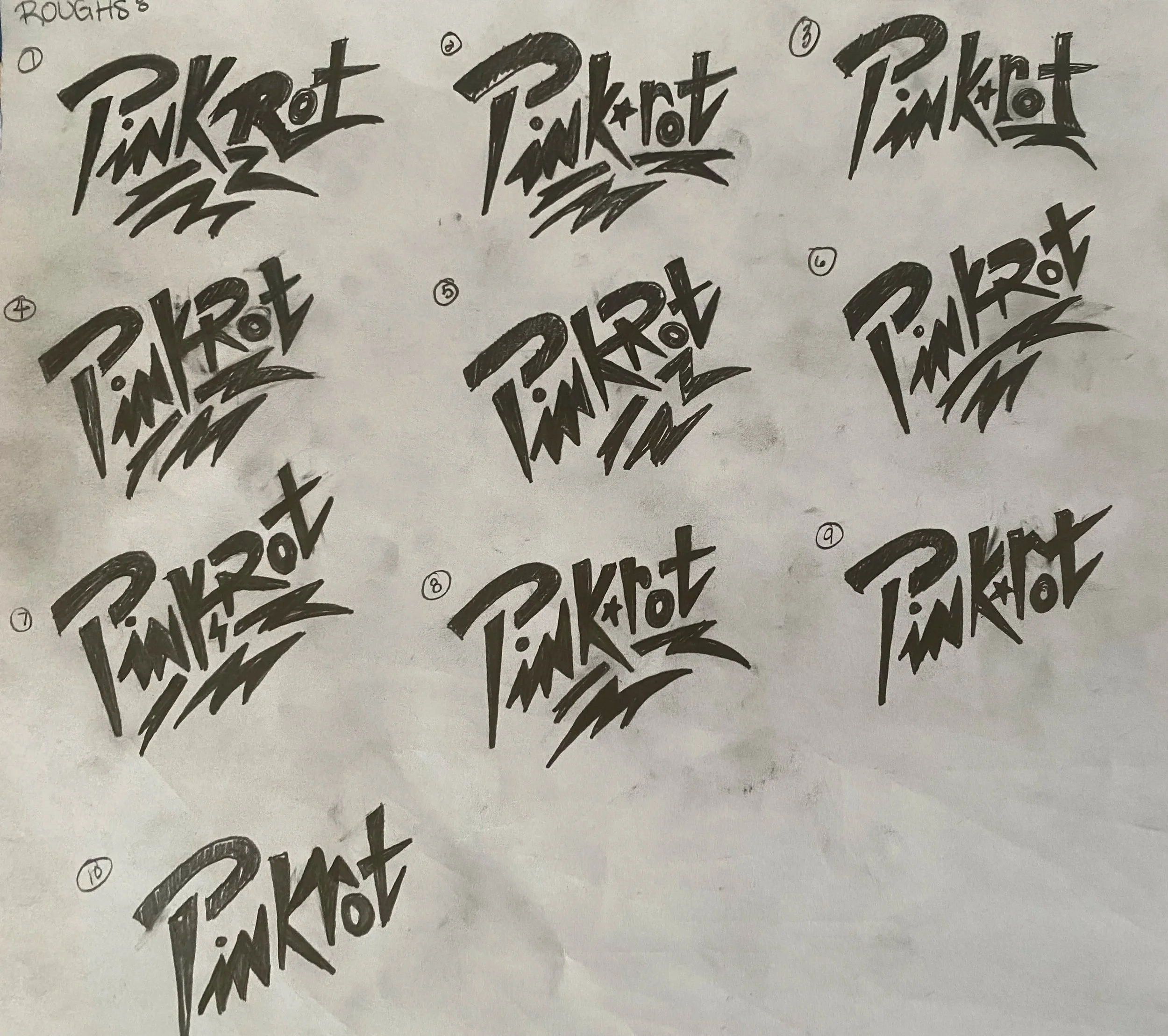
I wanted to create a logo for Pinkrot that felt very human-made and rebellious. I wanted to create an exciting logo that captured the environment of the alternative rock scene. I started with sketching different potential signature styled logos (by the end I had around 25 sketches). I experimented with textures, the outside shape of the logo, and some of the brand elements.
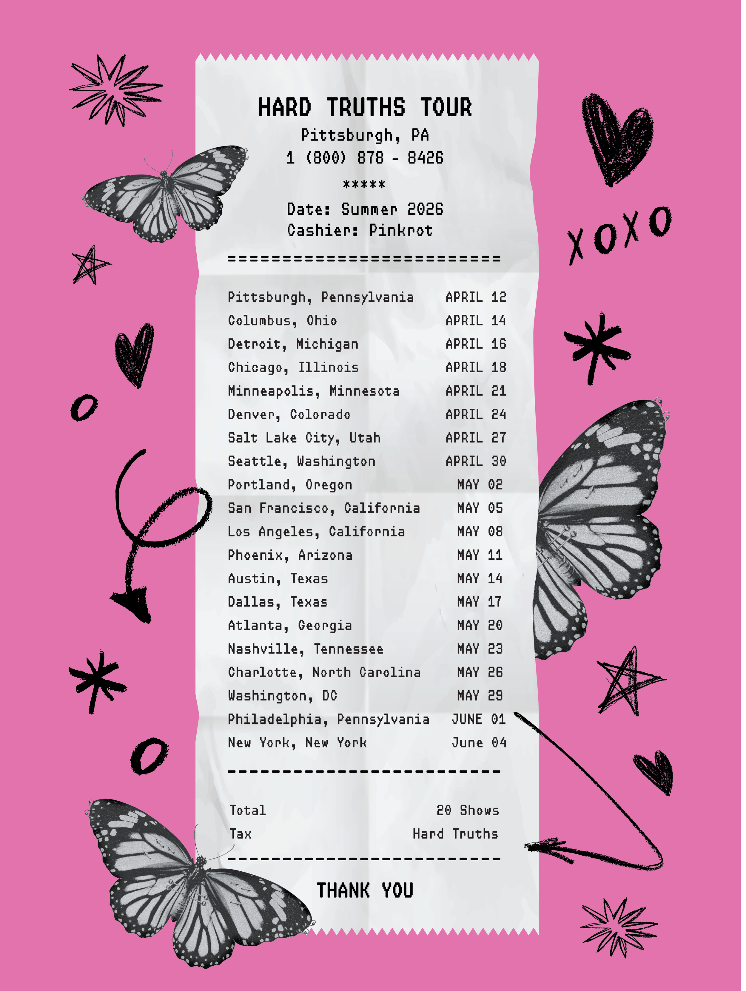
VINYL PROCESS
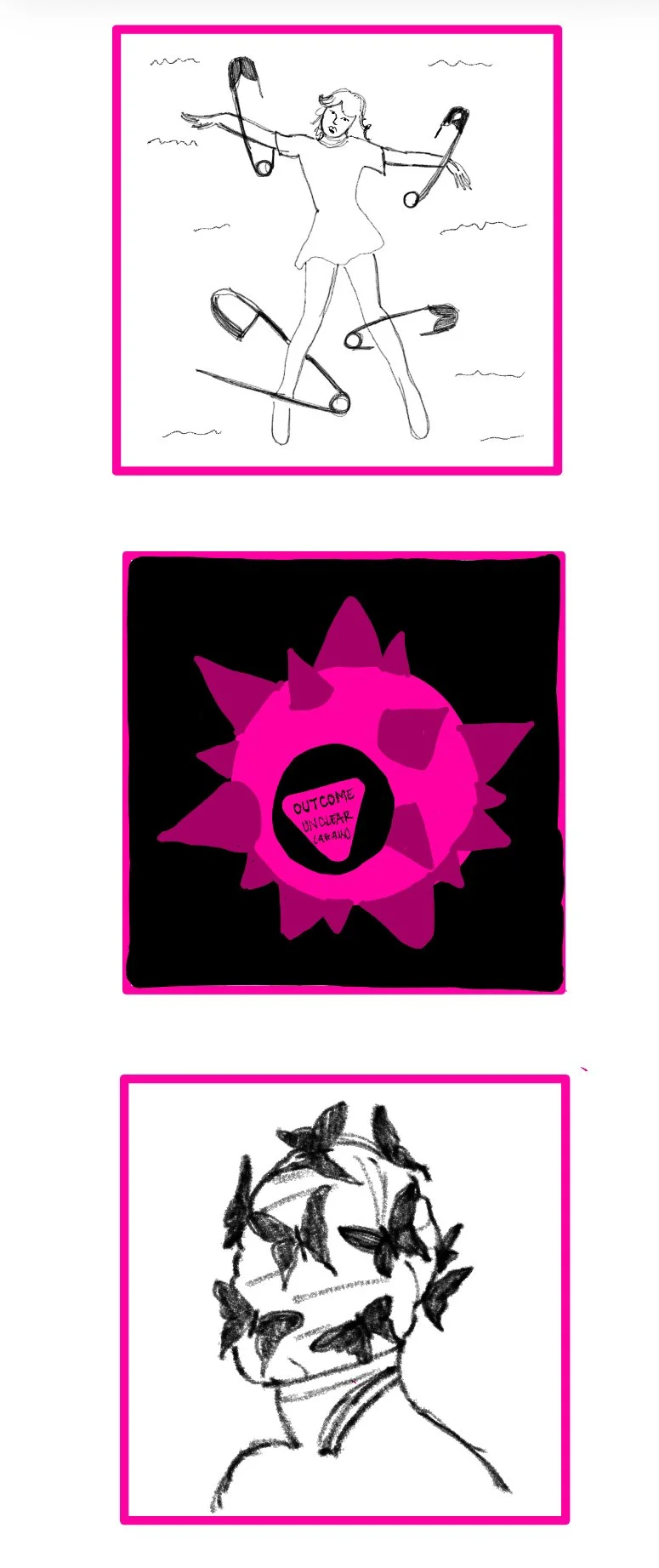
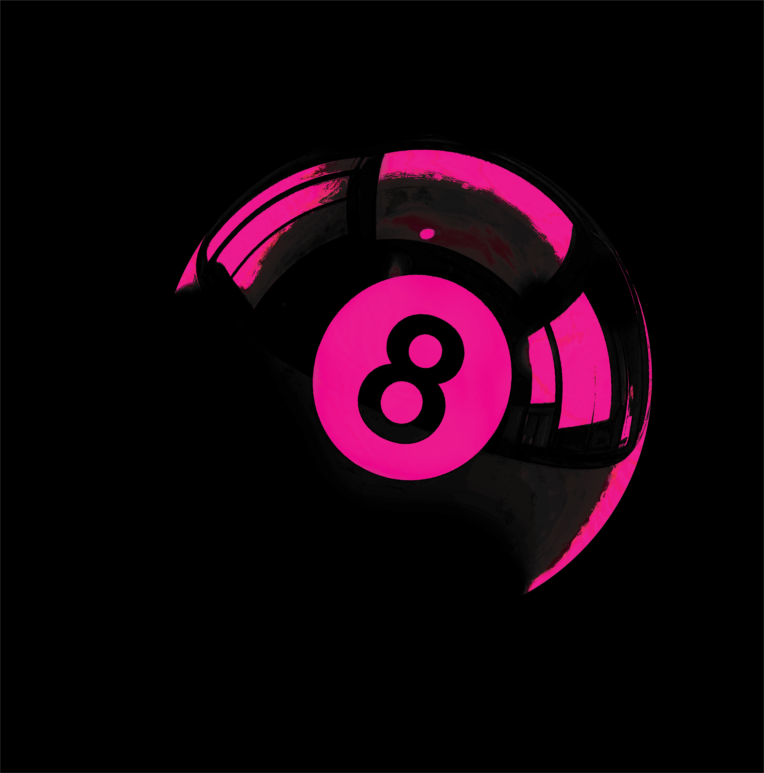
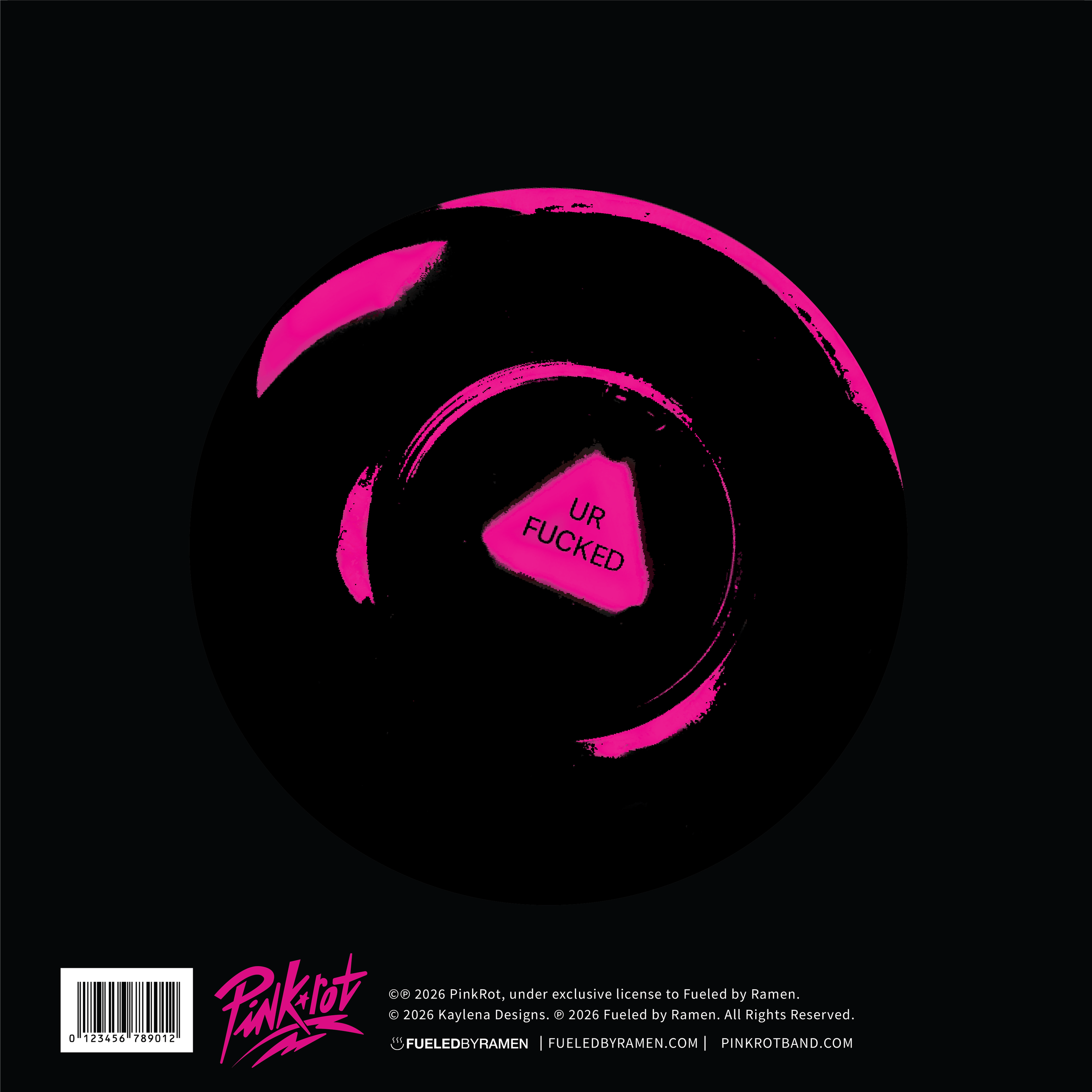
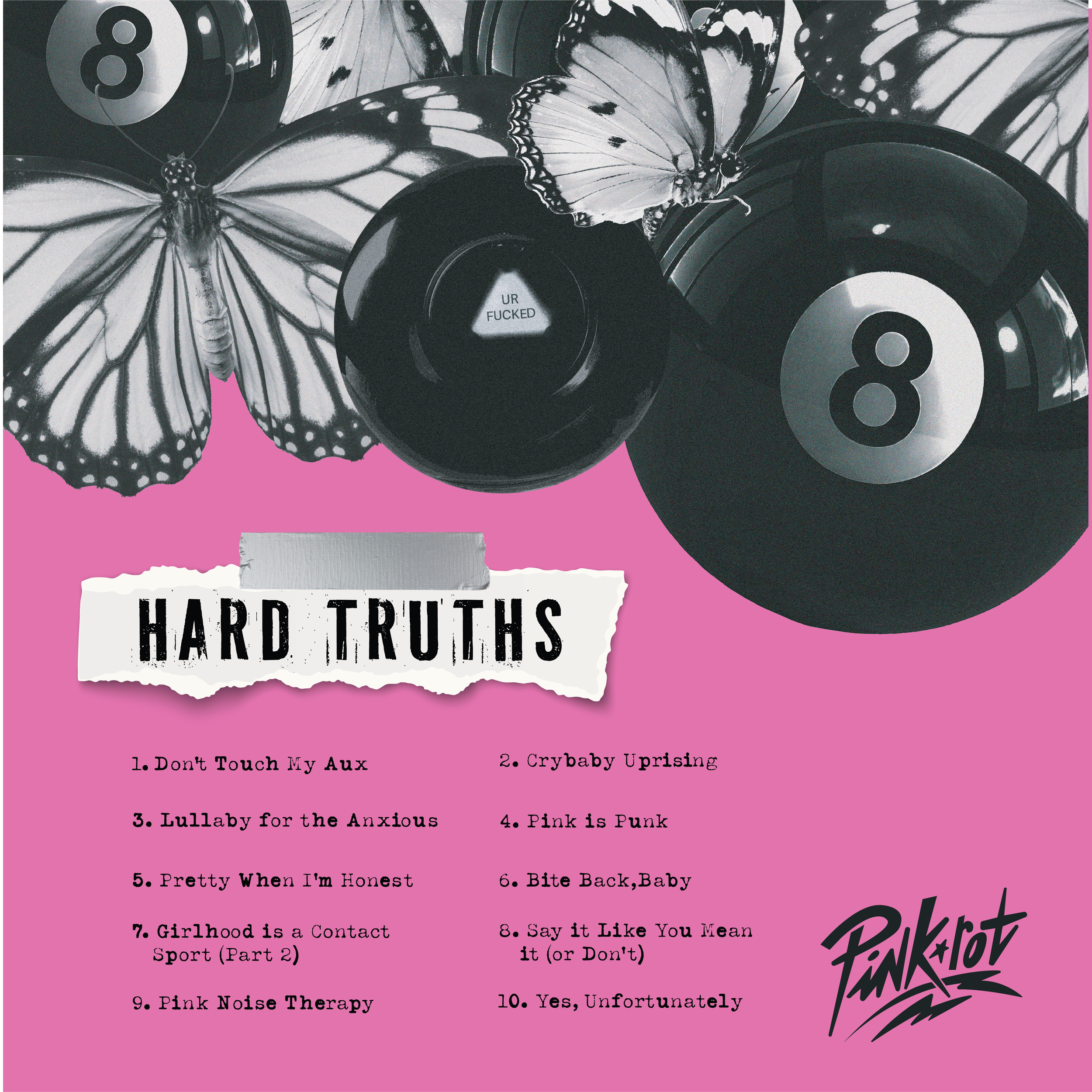
Very early on, I settled on the name HARD TRUTHS for Pinkrot’s album name. When exploring cover designs, I worked with elements that have creative ways of displaying some sort of truth to the viewer. I eventually worked on the first idea: A magic 8-ball that was spiked. I wanted to combine the truth element with something that is hard to endure. However, I realized that the hard part was the truth itself. At this point I decided to simplify the concept by removing the spiked and instead incorporating closure to further push the “looming” feeling.
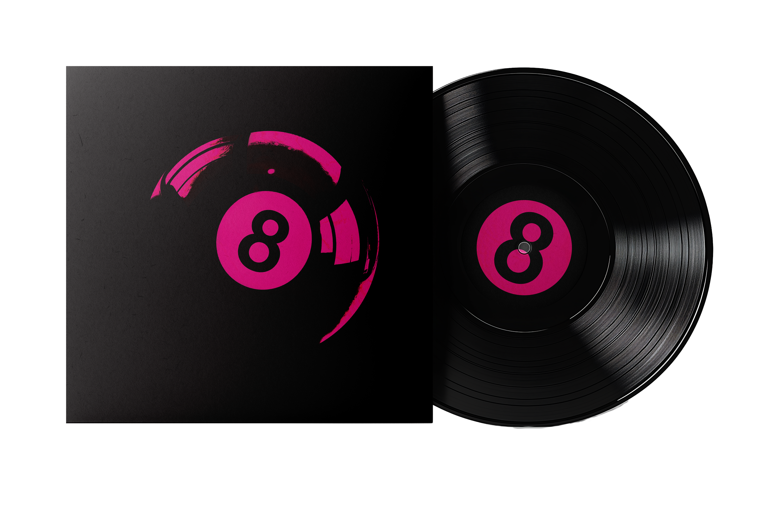
VINYL DESIGNS
T-SHIRT DESIGNS
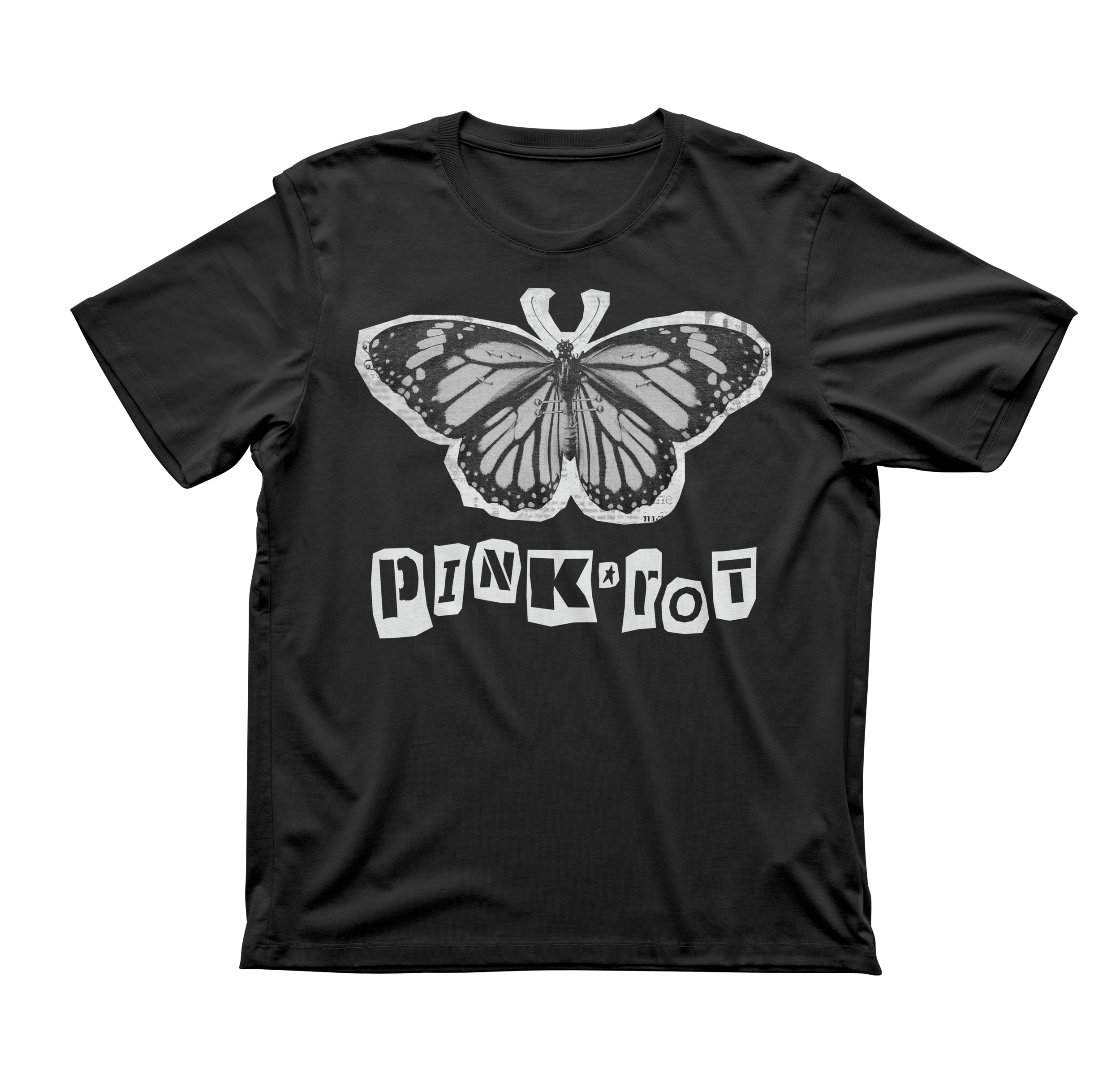
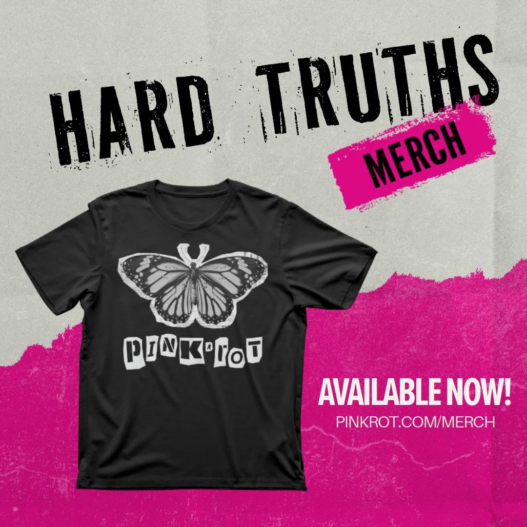
After creating some brand elements (pierced butterfly, 8-ball, etc.) I moved on to making merchandise. The HARD TRUTHS tour shirt reflects the album cover and tour banner designs on the front of the shirt. The back features a typographic stack organizing the different tour dates with other important elements including the logo and tour year. The HARD CONVERSATIONS shirt features the band sigil on the front pocket and the back features conversation hearts with hard truths on them. This idea was to juxtapose a soft and feminine element (hearts) with some hardcore phrases. My final t-shirt design features another juxtaposition of soft elements (butterfly) with some piercings to embrace femininity while also breaking the barriers of what that looks like.


POSTER DESIGNS
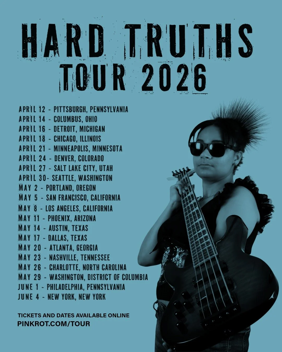
The HARD TRUTHS tour poster combines Pinkrot’s brand elements with a Y2K aesthetic as an homage to myself as that was the year I was born. The HARD CONVERSATIONS poster features the design used on the back side of the HARD CONVERSATION t-shirt.

SOCIAL MEDIA DESIGNS
As a part of my project, I incorporated social media marketing featuring 15 Instagram posts. I wanted to create a variety of content including photography, general graphics, short videos, and typography. Check out my Instagram for Pinkrot to see all 15 social media tile designs here.
WEBSITE DESIGN
As a part of my project, I created a protoyped website for Pinkrot including a homepage, tour page, merch page, music page, and electronic press kit. Although this website is just a prototype, most buttons actually go to the according page, so have fun and feel free to navigate through the website!